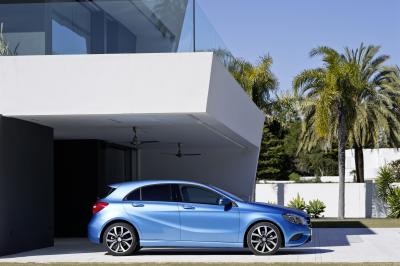
Photos of the New A-Class : This is How a Hatch Should Look Like
Clarissa April 13, 2012We’ve known a lot about the new A-Class, especially when it was shown in Geneva. However, it seems the company wants everyone to know that this is what a luxury hatch is, and it should be this beautiful.
“The new A-Class impresses thanks to its uniquely high quality standards for the compact segment, achieved through the design idiom, the selection of top-quality materials and the options for combining them. Attractive visual highlights include, for example, the air nozzles, which call to mind the form of jet engines and underscore the high quality of the interior,” the company’s Head of design, Gorden Wagener said. He added, “No other car in this segment is as progressive as the A-Class. Absolutely typical for Mercedes is the sculptural shape of the A-Class. The character lines, in particular on its sides, lend the A-Class structure and terseness. The new dynamic style is perceptible at first glance in the interior as well.”
Well, I agree, the A-Class is a beauty, yet it is elegantly simple.


Comments (4)
Pingback: When I was in the automotive propaganda company, certainly one of the most horrible experiences were changes on the top. Entrepreneurs can come and go without drama. Changing advertising executives meant serious trouble. It’s somewhat like Indian wi